RS Energy Reports
In order to start working with Energy reports, the previous setup steps have to be completed.
The purpose of the Energy reports are to:
Find improvement potential based on energy and CO2e
Measure electricity consumption per machine, line and article
Understand detailed production costs & CO2e per unit produced
Understand what kind of downtime/stop reasons consumes the most
Finding the Energy Reports
Energy reports are found ny navigating to the Energy option in the main menu and then clicking Energy Analysis.
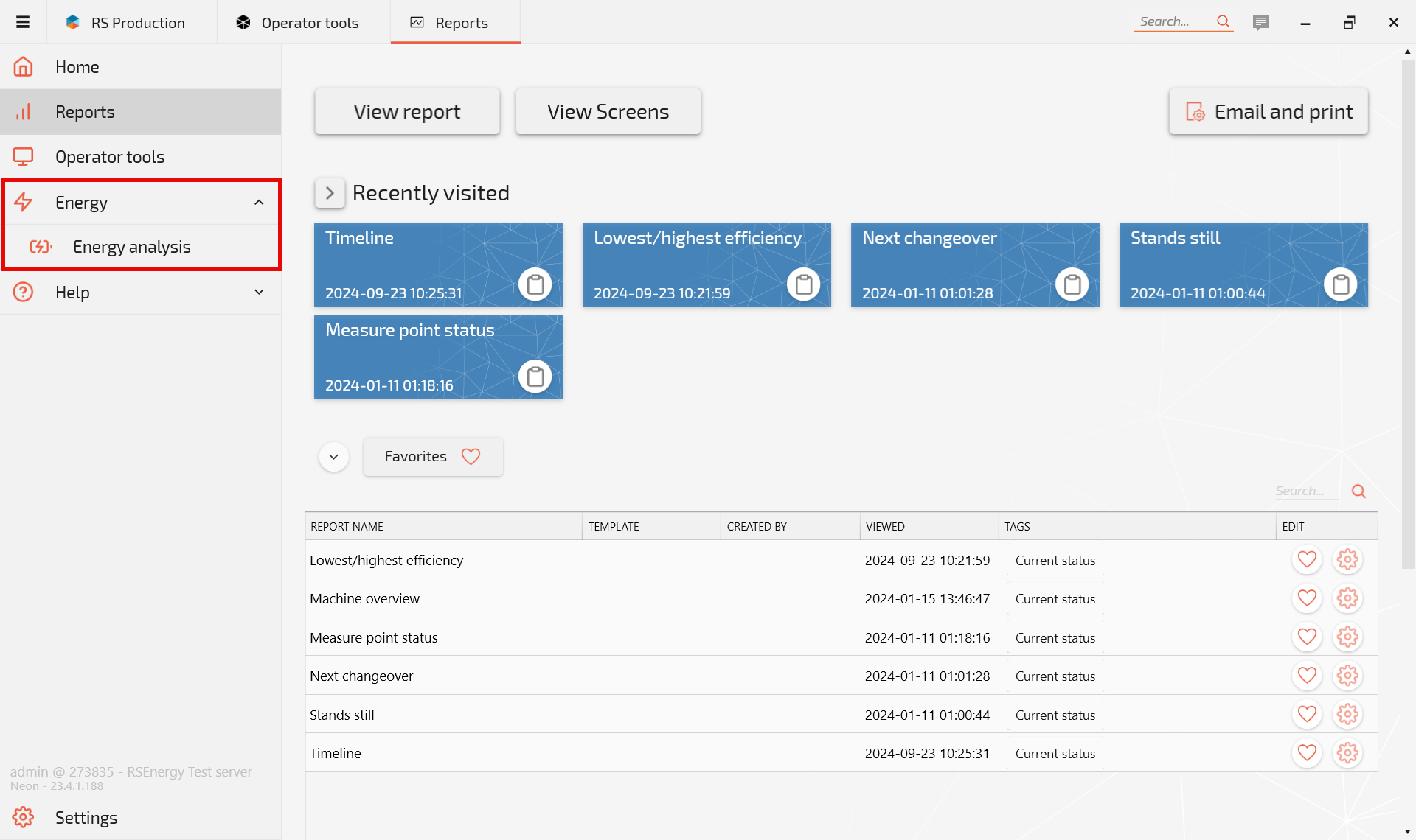
Energy Reports outline
Energy reports cover the following main features:
Energy Use
Peak Power
Value Adding
Waste - Stop time and loss
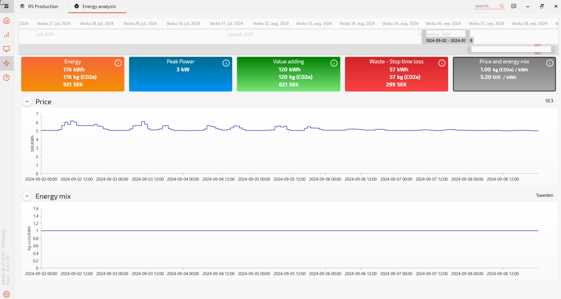
Price and energy mix
The purpose of the reports is to allow the user to get both an overview and detailed breakdown of energy use and how various machines use energy both during value-adding production and downtime.
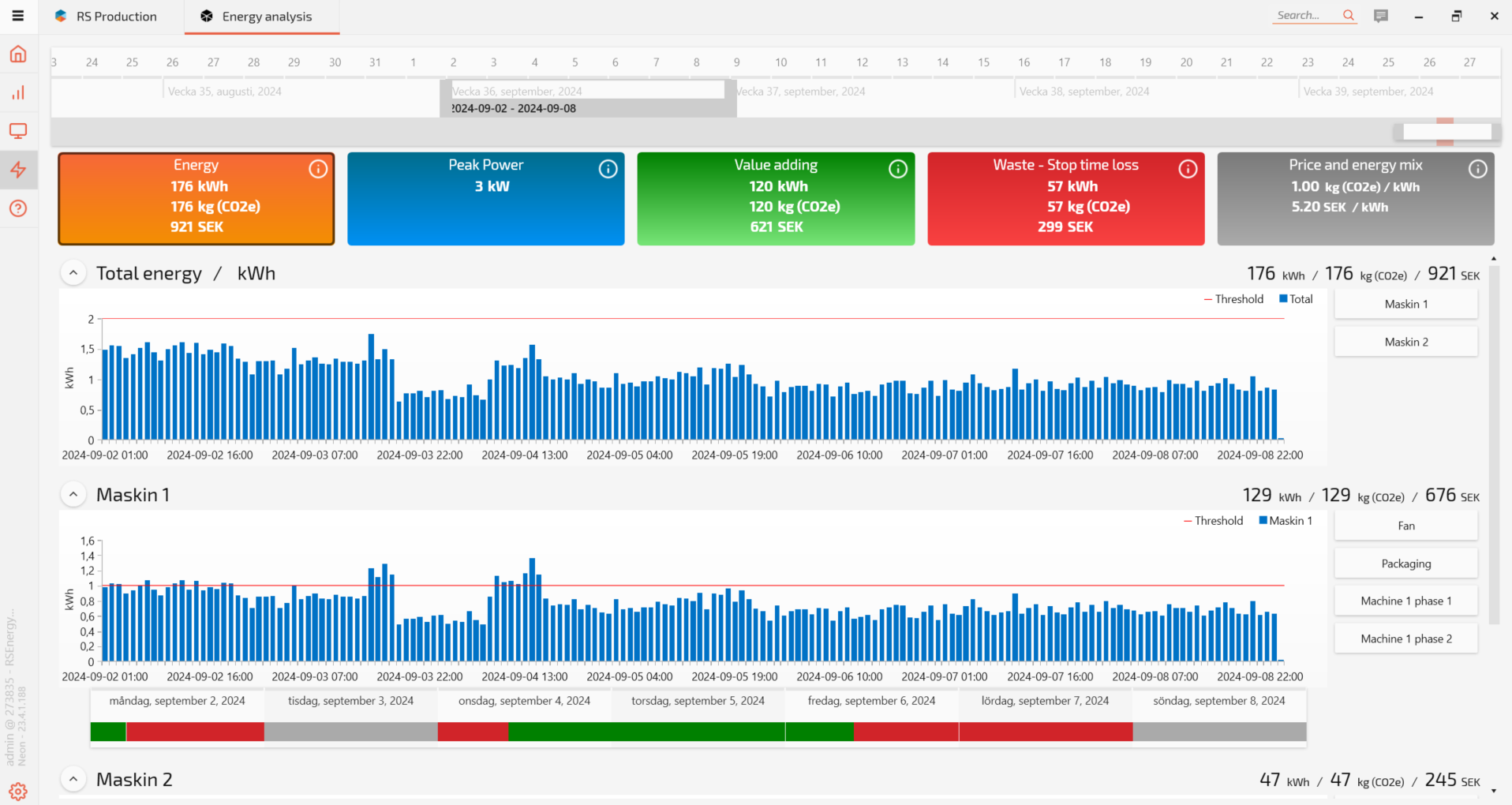
Navigating the reports
Click on the coloured squares at the top of the page move between the different Energy reports.
The small info symbol on the coloured boxes provide a short summary of the purpose and information in the report.
Filtering the data
In order to better understand the data provided in the report, there are a number of filter options that you can use.
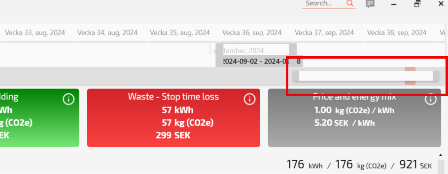
Scale filter
The scale filter is one of two timelines filters that you can you to zoom in and out of the timeline at the top of the page. Imagine that you want to look at a very long time series (such as two years). By pulling the scale filter slider to the left, the timeline at the top of the page zooms out. If you make the scale filter shorter, the timeline will shorten. The shortest time that can displayed is a day.
See scale filter below.
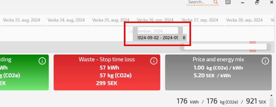
Timeline filter
Once you have set the scale of the timeline, you can use the mouse cursor to change the exact days that you want to review. Simply grab the edges of the time filter block that is currently showing and lengthen or shorten it.
Information toggles
The final filters that is useful to understand are the information toggles. These allow you to turn on and off a data series. In our example, we have connected two power sources to a machine. The default mode is that both sources are shown as a combined outcome. However, I would like to see both power sources stacked in the graph. By clicking on both the information toggles, both sources show up with different colours in the chart.
Before:

After:

The toggles can be used to display one or many of the power sources in the analysis.
Energy
The first report outlines energy consumption, CO2 footprint and direct energy cost per machine and aggregated total. The outcome varies depending on the timeframe that is set for the analysis.
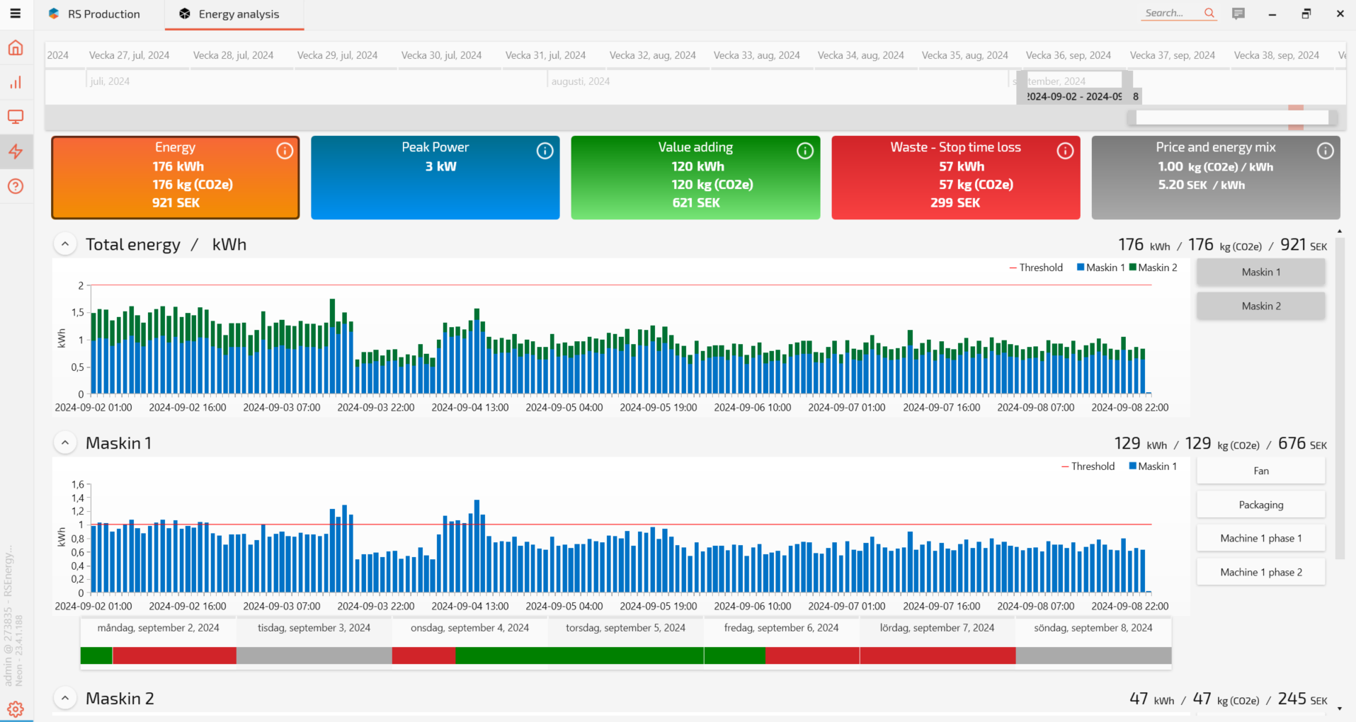
The red and green bar below the machine shows whether the machine was running, idle or turned off.
Peak Power
The Peak Power report shows peak power consumption per machine and the aggregated total.
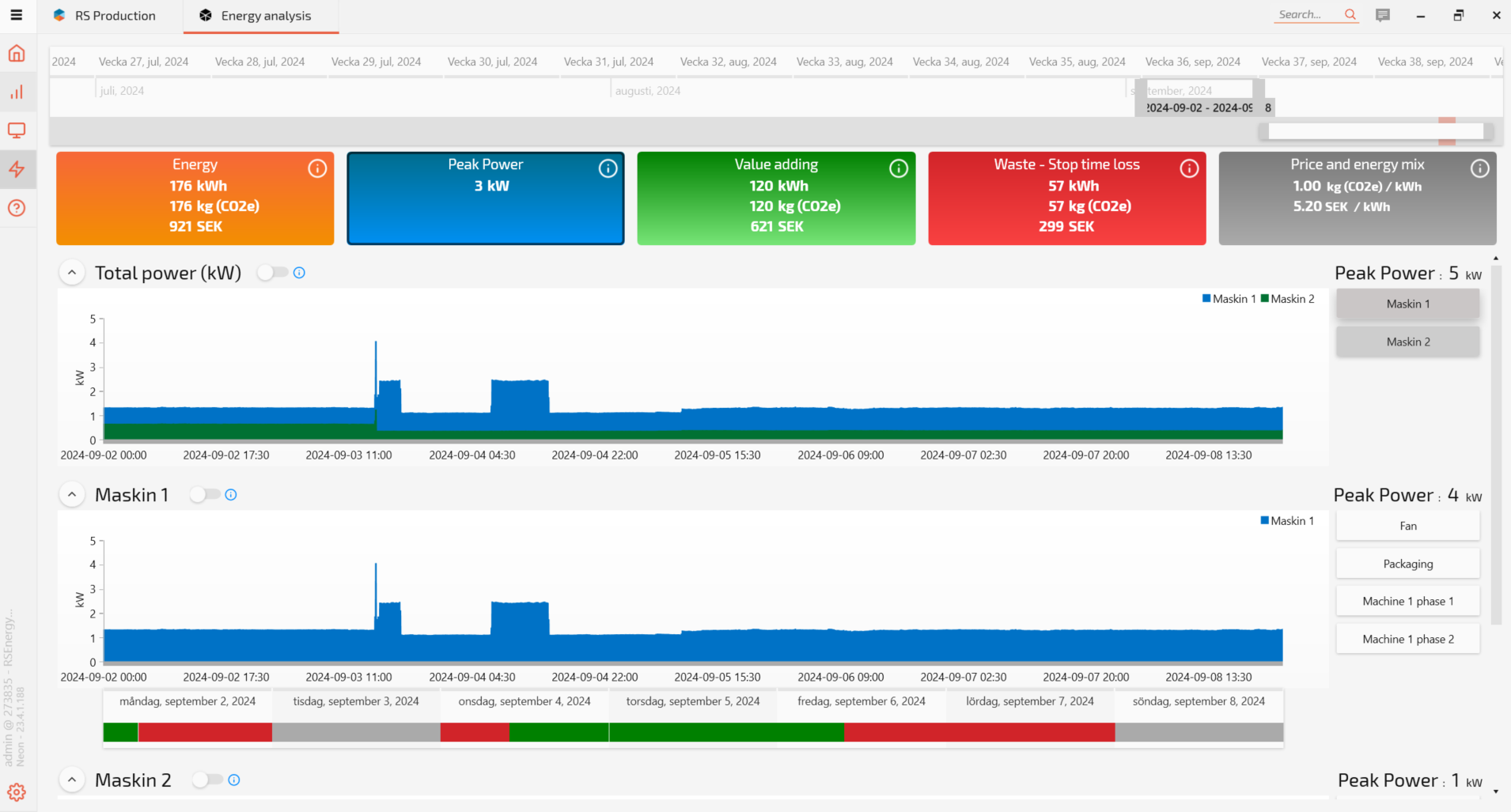
Value Adding
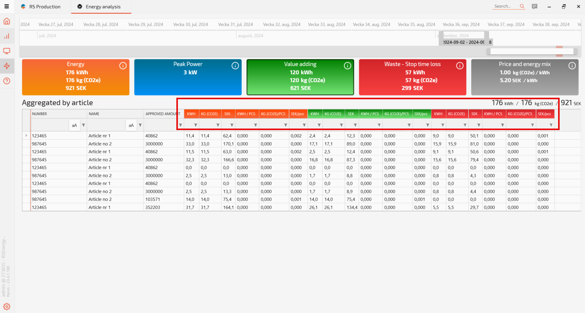
The Value Adding report shows energy consumption, CO2 footprint and direct energy cost per article and operation.
In the report below, the orange field is the total for the article per factor, whereas the green section shows the same data during good production and the red section shows the same numbers during machine downtime.
Waste - Stop time loss
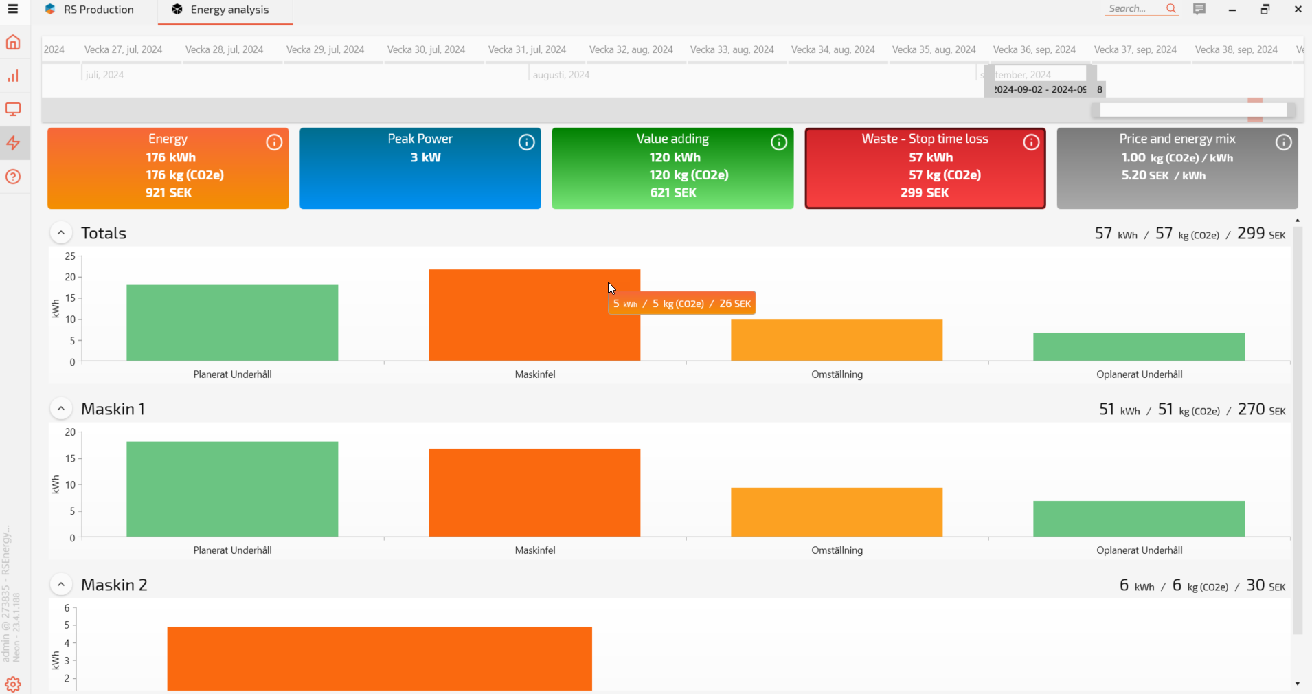
This report shows a pareto chart shows the loss reasons that steal the most energy (kWh), CO2 and energy cost without creating any customer value.
Price and energy mix
Graphs showing the cost and CO2 factors per kWh for all the different energy types consumed. Energy mix settings depend on the settings you will have configured previously in the Settings.
Continue to the next page: Displaying your Energy data - InfoScreens - Setup and configuration guides - Confluence (atlassian.net)